Typographic Systems at the Natural History Museum
Last Saturday I hauled my crew down to London to visit family members who were visiting and staying in Maida Vale. We went to the Natural History Museum.
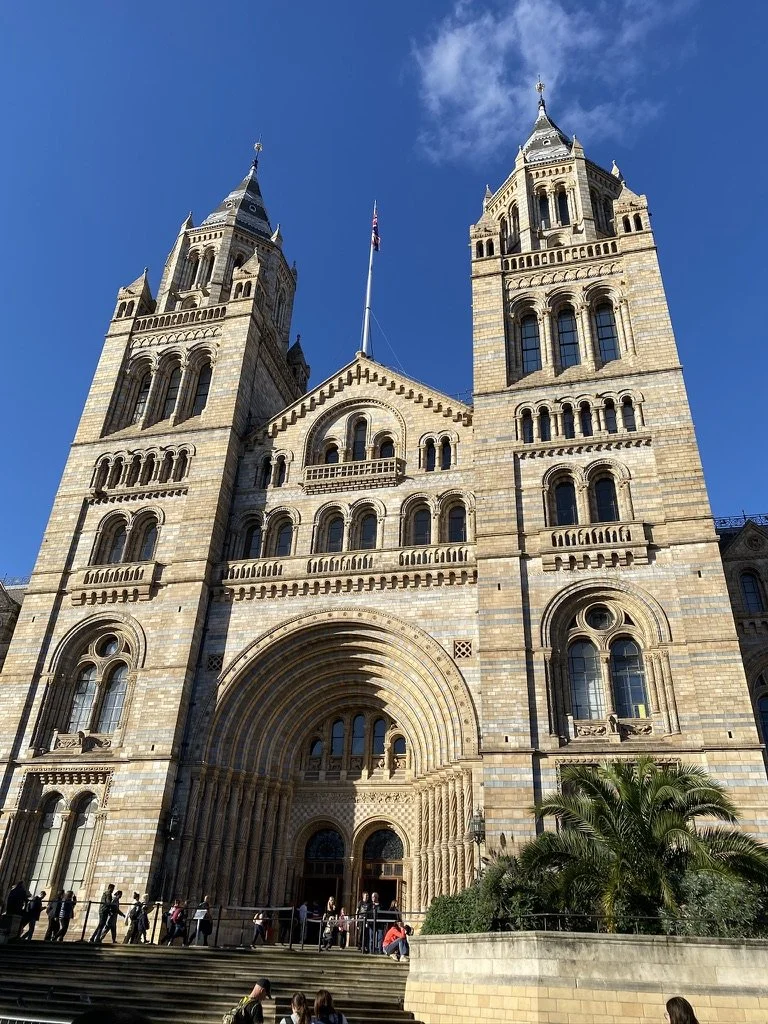
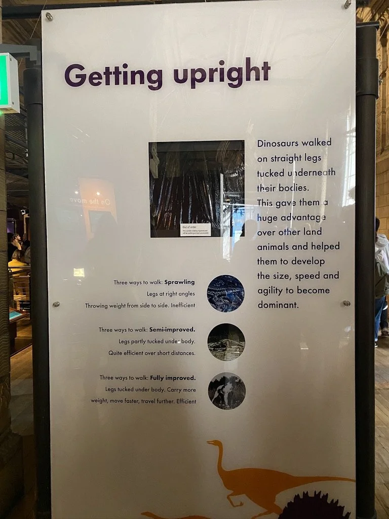
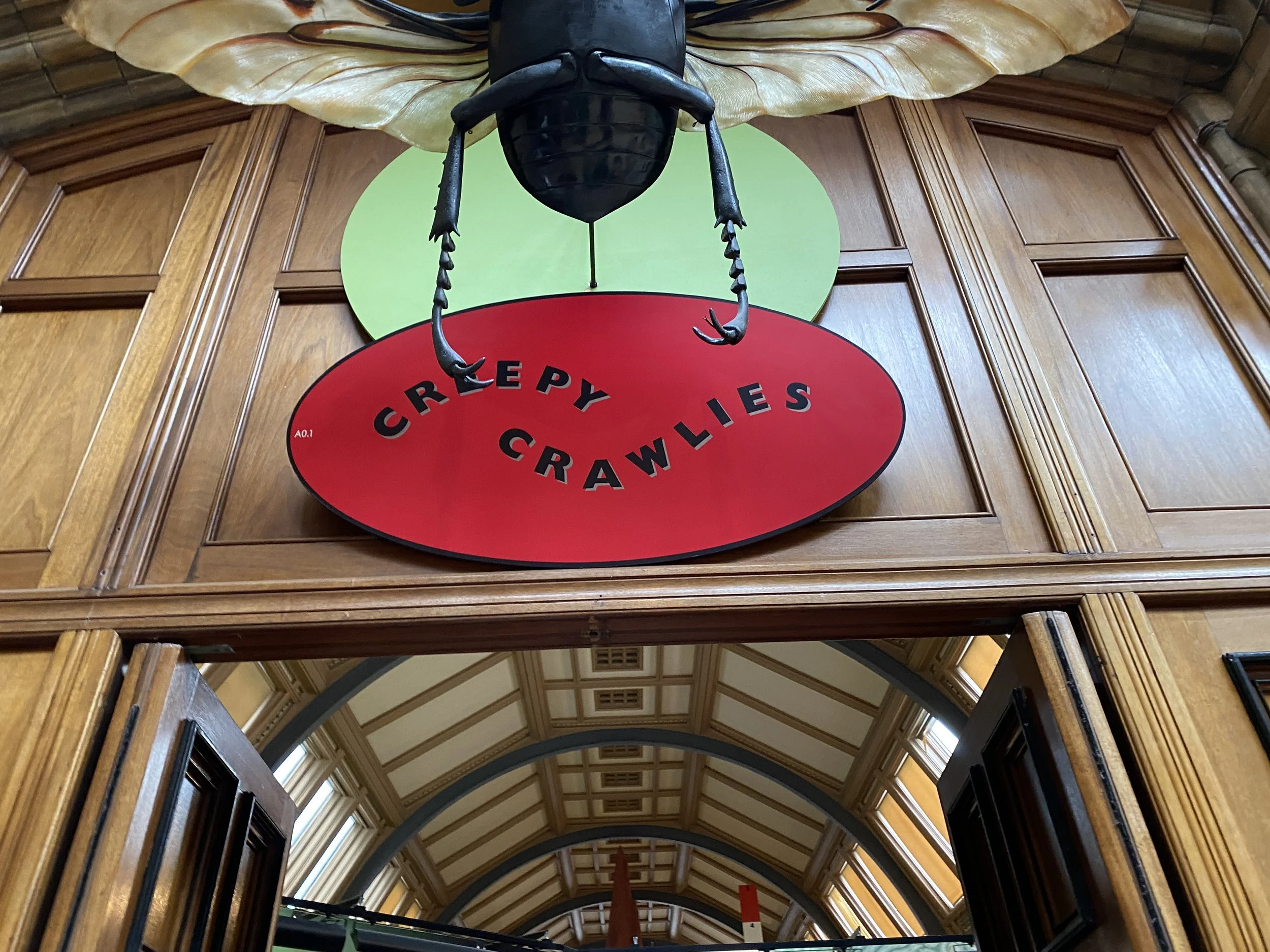
While other people were taking images of bones, and stuffed birds, and butterflies (I did a bit of that too), I noticed that the Typographic Systems started popping up in rooms, on glass, and on directional signage throughout the Museum. Naturally, I set myself a challenge: Could I find all 8 within this beautiful building? The answer is: nearly.

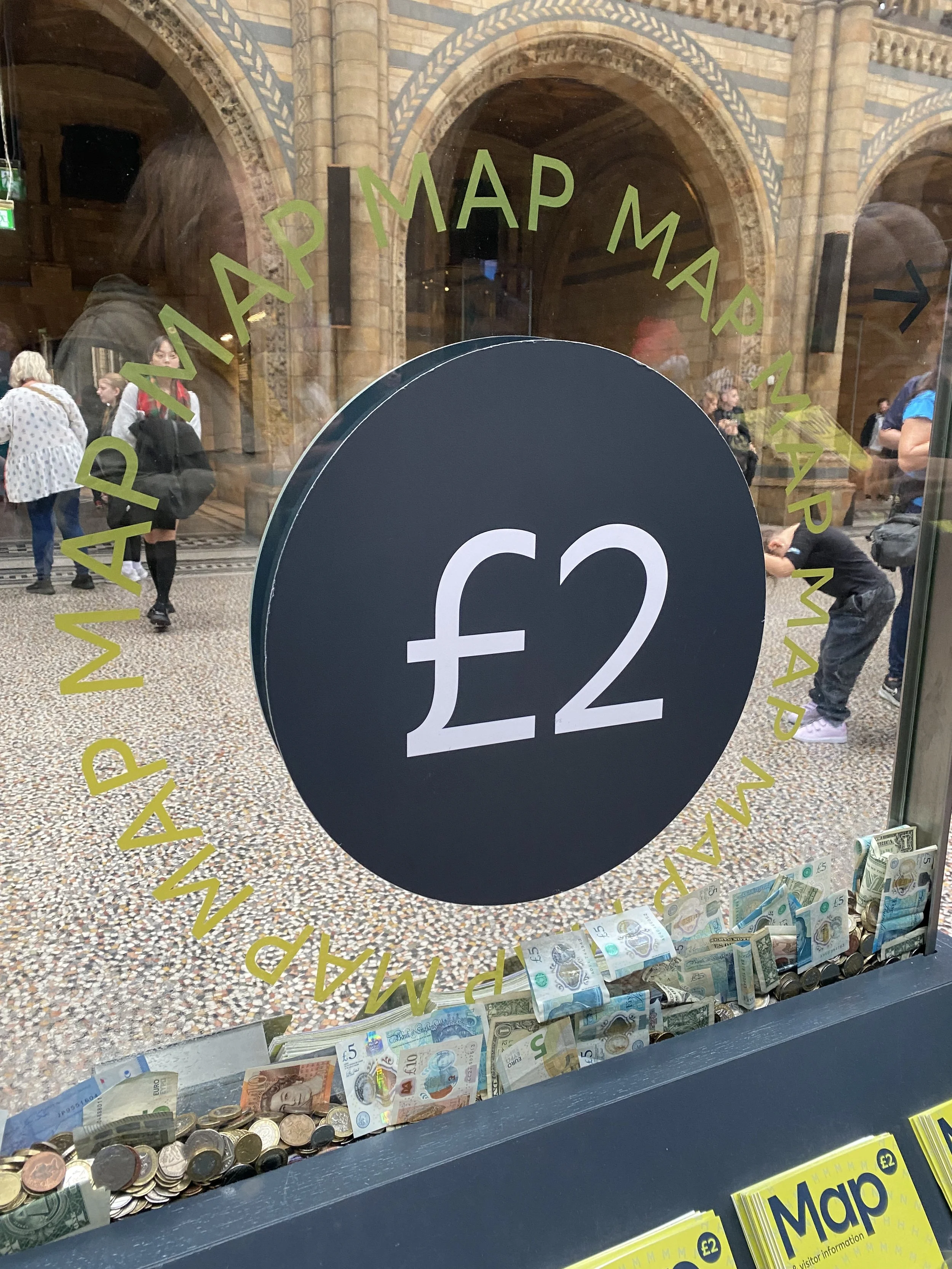
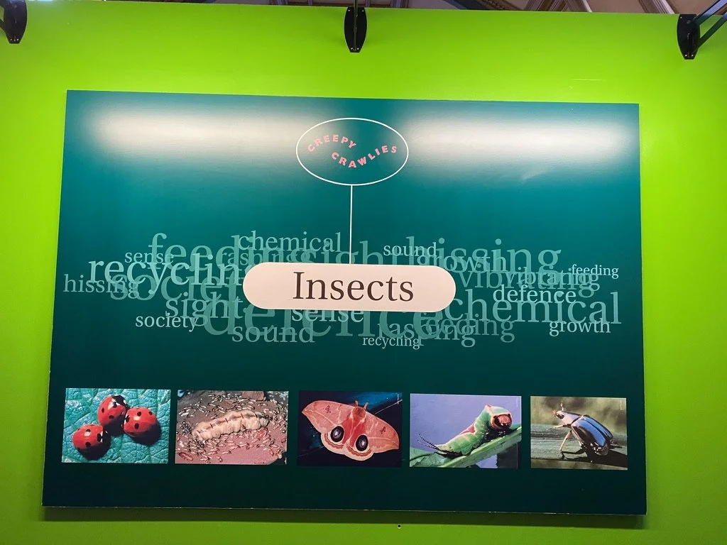
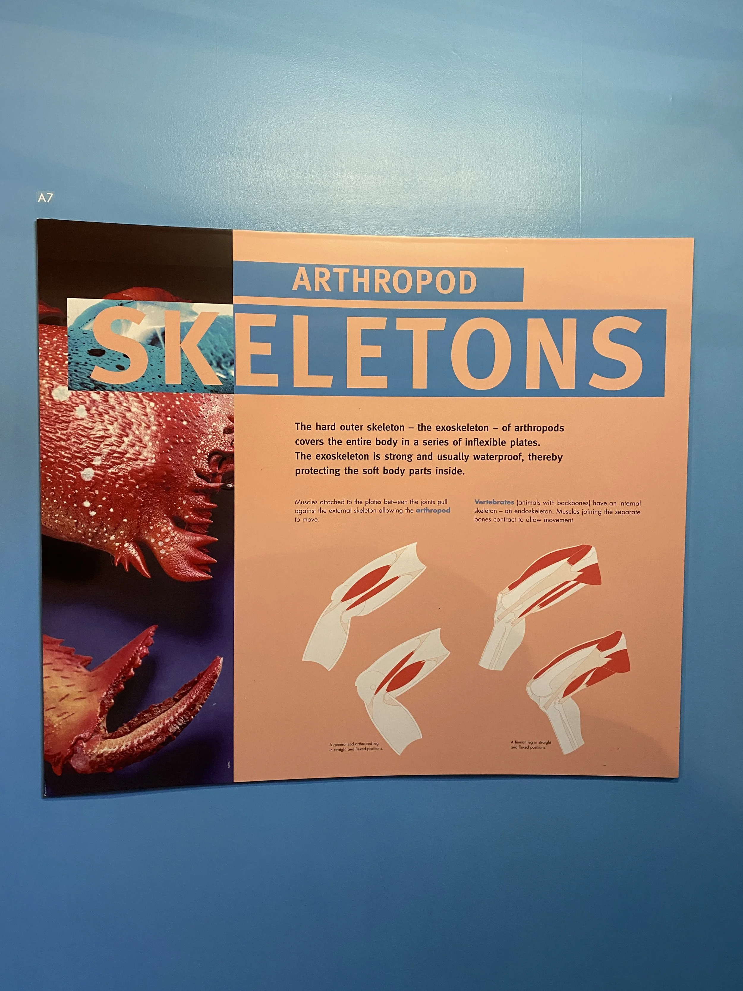
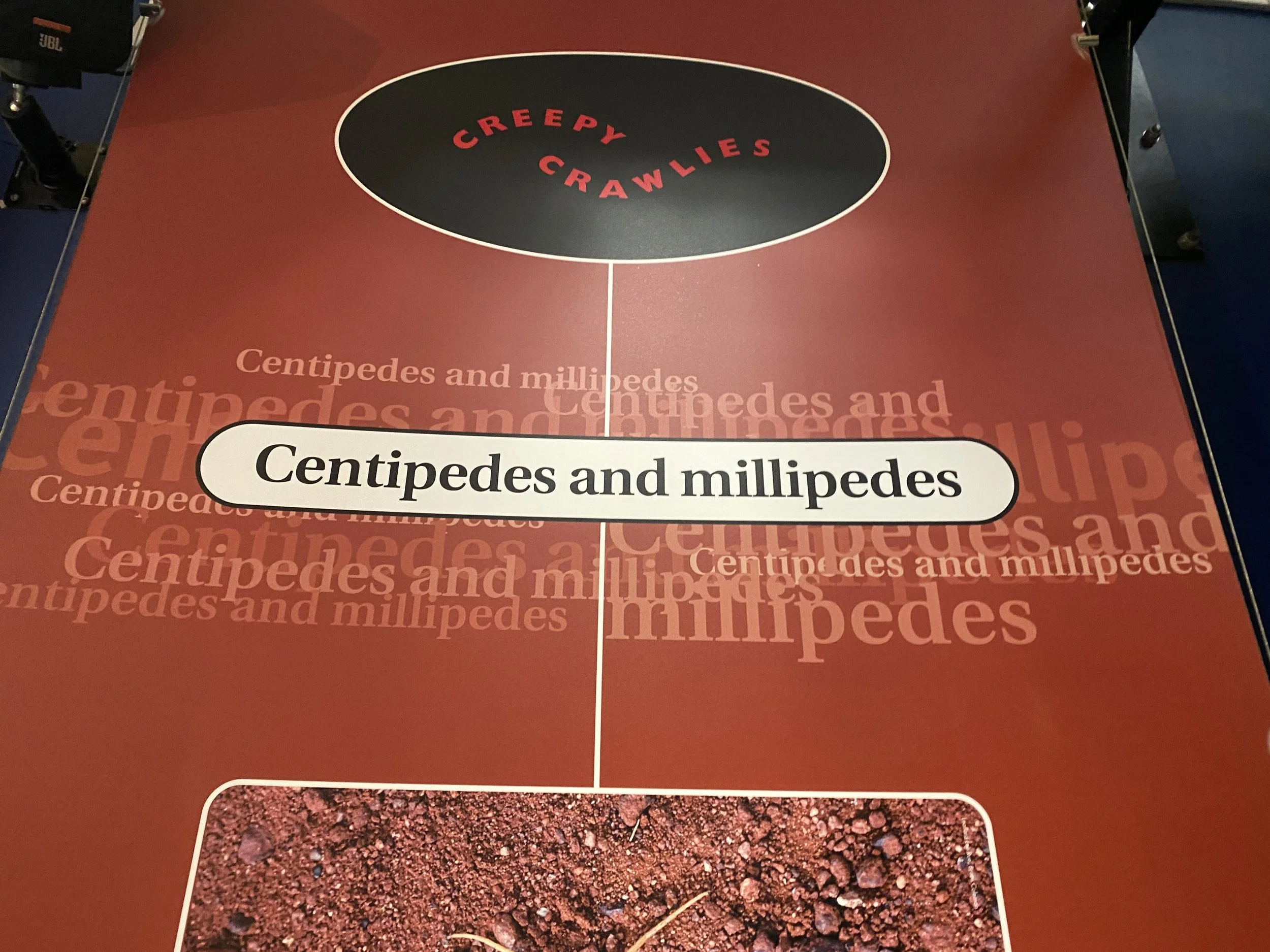
I also found it comforting that many of these systems worked together with images, and some (like random and bilateral) were used together to compliment and contrast each other nicely. Do you know your typographic systems? Can you name them? Which one did I miss? And does the new NHM logo cover that system? Or is it purely dilatational?

There was a heated discussion as to whether the new logo (which I am still getting used to was only dilatational (which is clearly is) or if it also had a radial aspect to it. What do you think?