The Axial Typographic System: a further look.
What are the typographic systems?
Codified and published first in 2007, Kimberly Elam introduced the term Typographic Systems to the design and typographic world. They consist of eight distinct compositions, often used to create interesting and dynamic layouts. Considering this timeline however, I myself learned a form of this back in the stone ages while going through graphic design in the mid ‘90s. After a quick chat with the digital oracle we concluded that I am not having a mis-memory, but most likely learned a form of these systems under slightly different names. Considering our extensive study around the swiss grid, constructivism, dadaism, futurism, pop art, bauhaus — to name a few — these systems are found within these pieces of art history and incorporated within our education. There are eight: Axial, radial, dilatational, random, grid, modular, transitional, bilateral. Today I’m going to look at the axial typographic system
Axial typography: Alignment is everything.
The axial system is pretty straightforward: all elements are arranged on either side of an invisible axis or line. This line does not have to be vertical or horizontal. It can be angled, curved or zig zagged. Examples exist throughout the history of design.


above left: El Lissitzky cover Catalog cover by El Lissitzky, in the Bauhaus asymmetric style. Courtesy of the Newberry Library, Chicago above right: Design by El Lissitzky for a two-page spread from Dlya golosa (1923; For the Voice) by Vladimir Mayakovsky. Collection of Philip B. Meggs
Whether it is called alignment, asymmetric, or axial, this treatment has existed in many forms within art history.
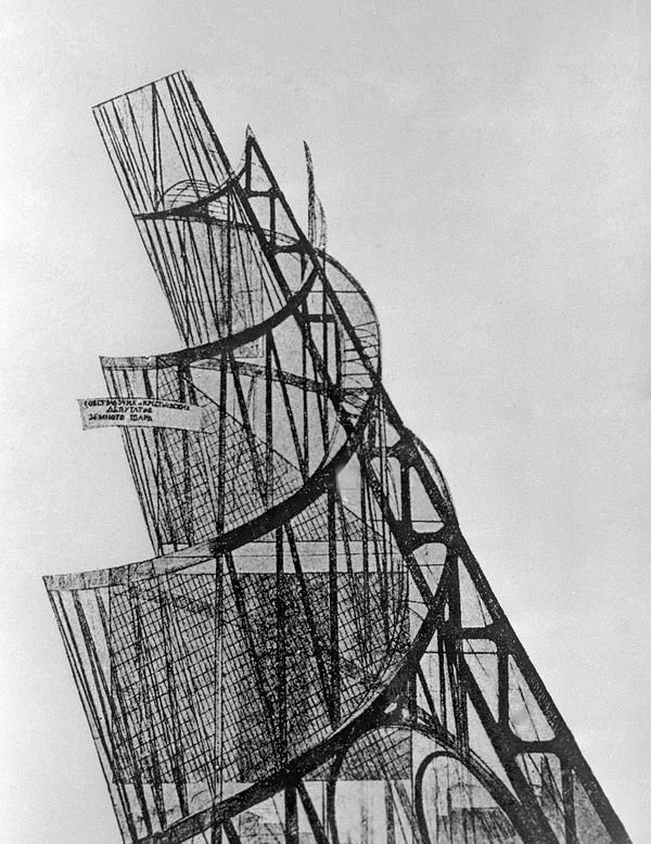
Monument to commemorate the Third International, 1919-20 (litho), Vladimir Tatlin / Shchusev Russian Architecture Museum / Sputnik / Bridgeman Images
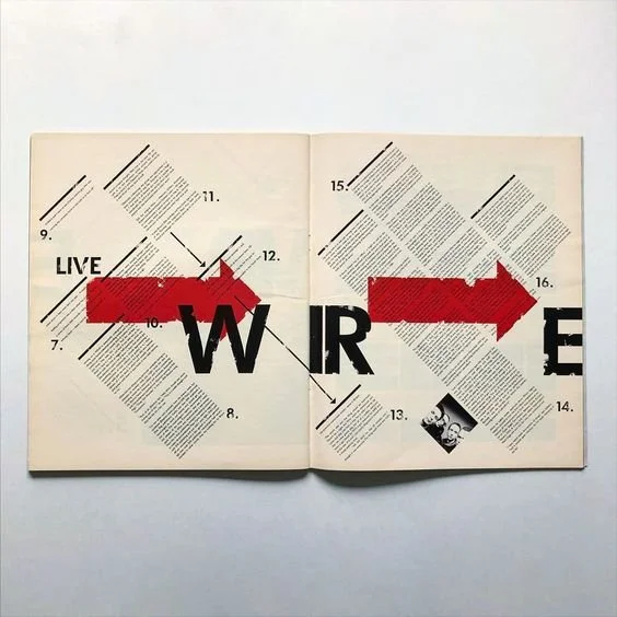
Spread from Raygun Magazine. Year unknown.
While the focus is on the axis and alignmment. There is a complex association with grid based layout that works within this typographic system.
Axial typographic system practice.
Naturally, I had to get into the mix here. Recently I’ve been obsessed with .. um reading Tasmyn Muir’s Locked Tomb series. Grabbing a few quotes from the three published books so far I came up with this:
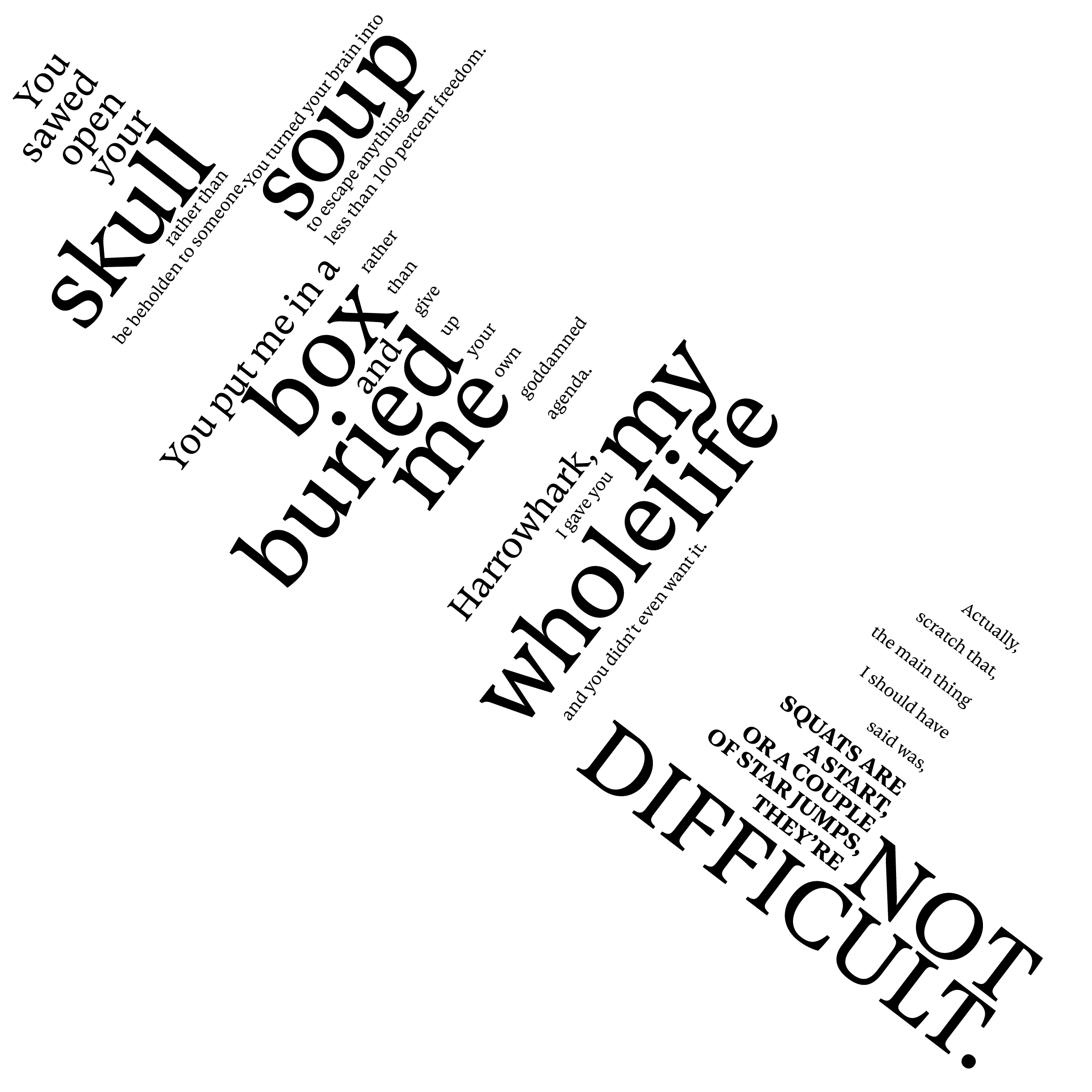
"You sawed open your skull rather than be beholden to someone. You turned your brain into soup to escape anything less tahn 100 percent freedom. You put me in a box and buried me rather than give up your own goddamned agenda. Harrowhark, I gave you my whole life and you didn’t even want it. Actually scratch that, the main thing I should have said was ‘SQUATS ARE A START, OR A COUPLE OF STAR JUMPS, THE’RE NOT DIFFICULT’”
I kept a strict parameter of 200mmx200mm artboard, one typeface and no colour. Multiple axial lines create an interesting contrast. For the iteration junkies out there, and any student that might have stumbled upon this blog: CHANGES IN YOUR LAYOUT AND VERSIONS, THEY’RE NOT DIFFICULT (See what I did there?). I put a light background checkered to show the square boundaries. It took a while to get happy with the result of this exercise. One solution does not always work. Though with each version, another 3 versions could be produced from it.


