Typoetry
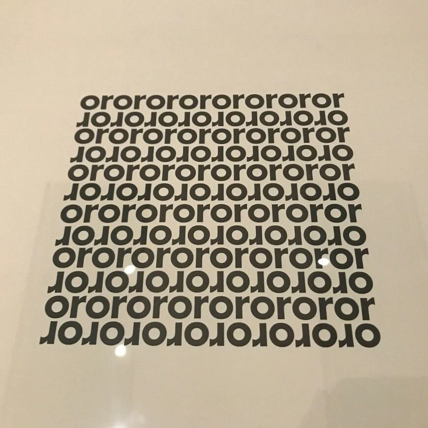
Last week I had the privilege to go into London for a quick 24+ hours. While I was there, we visited the Tate Modern. I stumbled upon a small case exhibiting Typoetry. This selection was by Augusto de Campos. The Tate Modern had this to say about typoetry:
“This was a form of visual poetry where the composition of the typed text contributed to the meaning of the poem. Sometimes the letters or words have no meaning of their own or only function as images. Typoetry was connected to ‘concrete poetry’, a genre initiated in the 1950s in Brazil by artists such as de Campos and his brother Haroldo.”

In design, I often forget that communication can come from many paths. There sometimes feels like there is this hard designation from art and design when really we communicate. Is it usable? Is it accessible? What is it communicating? Recently I’ve been really concerned with “the user” and this was a nice reminder that communication exists in more ways than one.


Augusto de Campos’s Lygia Fingers, a poem from 1953 for his wife-to-be, Lygia Azeredo, highlights the international tendencies of concrete poetry; it appeared in a portfolio of concrete poems by European and Brazilian artists issued by the German printer and publisher Hansjörg Mayer in 1964. From 13 visuelle Texte (Stuttgart: Edition H. Mayer, 1964). The Getty Research Institute, 1357-116. Courtesy Augusto de Campos
Which made me wonder what concrete poetry was. I had seen a lot of different typographic movements, but this one I wasn’t particularly aware of. I found this on the Getty blog:
“Concrete poems are objects composed of words, letters, colours, and typefaces, in which graphic space plays a central role in both design and meaning. Concrete poets experimented boldly with language, incorporating visual, verbal, kinetic, and sonic elements.
Created in the 1950s, ’60s, and ’70s, the works still resonate in our own era of streamlined communication, in which messages can be conveyed via texts using single words, acronyms, and even emoji.”
I find the examples lovely. I am reminded of the eight typographic systems, and how they continue to work within a functional art and design space.
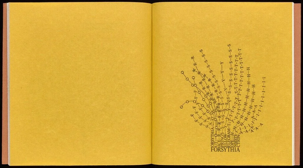
Forsythia, Mary Ellen Solt, 1965. From Flowers in Concrete (Bloomington, 1966), n.p. 94-B19512 copy 2. Gift of Susan Solt. Courtesy of the Estate of Mary Ellen Solt
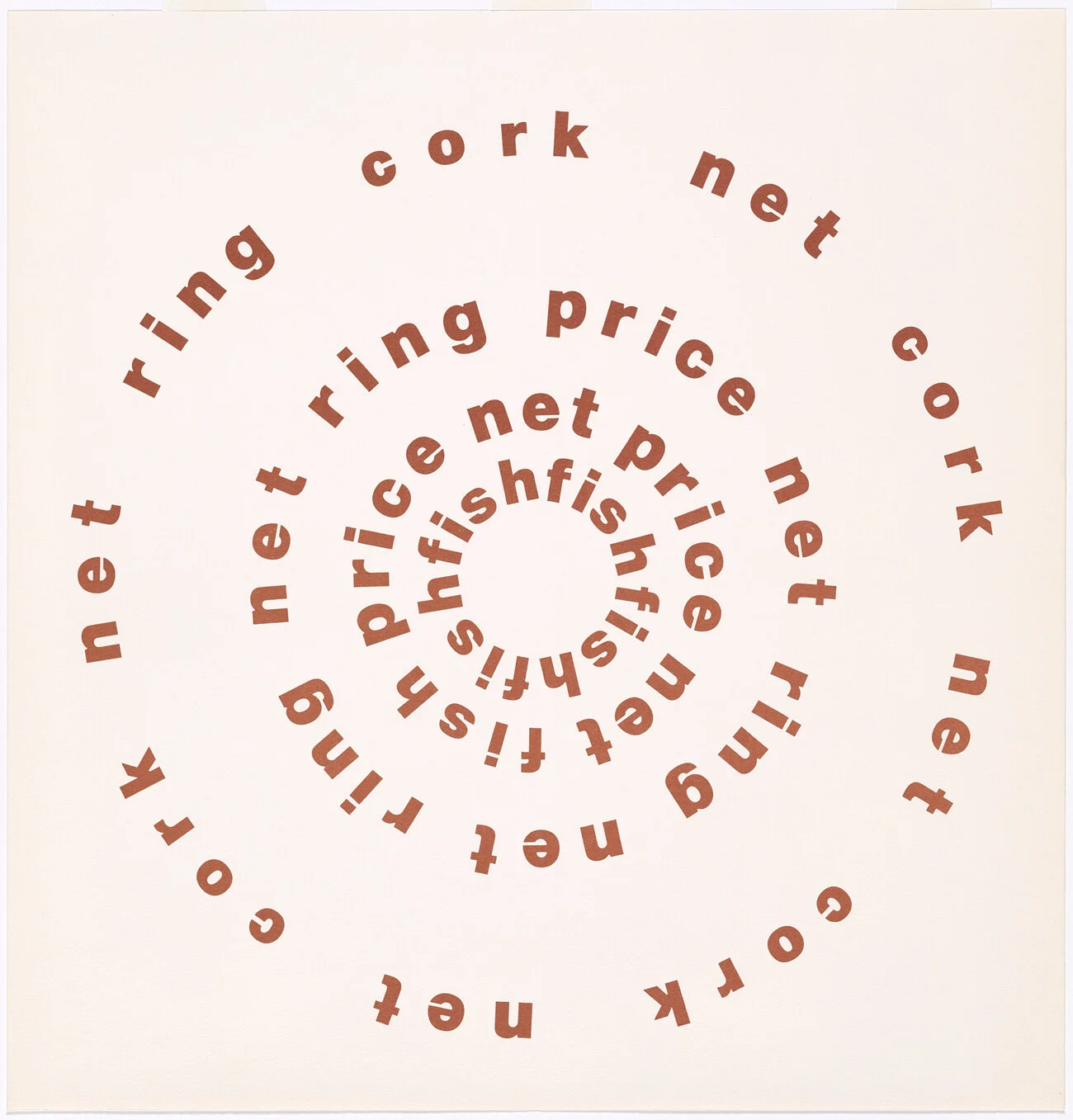
Cork/Net, Ian Hamilton Finlay. From The Blue and the Brown Poems (New York: Atlantic Richfield Company & Jargon Press, 1968). The Getty Research Institute, 2016.PR.36. By courtesy of the Estate of Ian Hamilton Finlay