ART of Balance
A couple of weeks ago I had a client come and ask for an identity for her new reflexology practice. She is an artist by nature and already had an idea for what she wanted to explore. She wanted to see what we could do with this symbol she created.
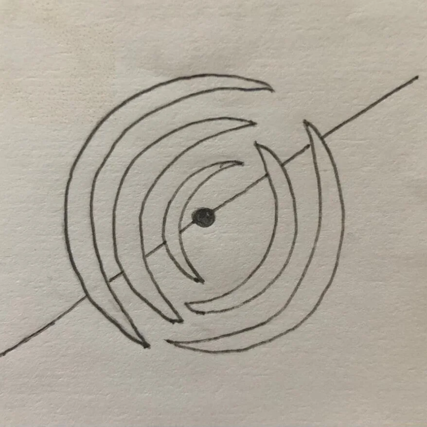
hand drawn by the client
I got to work using illustrator and some nifty brushes to make a similar effect to what she was hand drawing.

Round 1 with brushes and pathfinder tools
She ended up preferring a blend between a clean cut of the circles and a more brush like axis. We went from there.

Her handwriting which I tried to find a good balance in a typeface
I worked with typefaces that looked similar to her handwriting — something I find very distinct and beautiful.

ART can look very similar to ARP even if the P is backwards
After a search on Adobe Fonts I found that grafolita script looked least like ARP with a backwards P. I played around with the kerning and messed with the nodes to make a more distinct T. Having all caps in a script is difficult at the best of times, but we felt this was a good solution.

grafolita script
Second direction from client. Seeing it as stacked.
My client was happy with this direction, and gave me another sketch for how she has envisioned her identity. So I took this and made two different ones. I helped her consider that sometimes a stacked logotype might not be the best fit so I gave her the option of using two. I knew she wanted blue so I ran with that.

exploration of colour, 2 colour vs 1 colour and open vs filled.

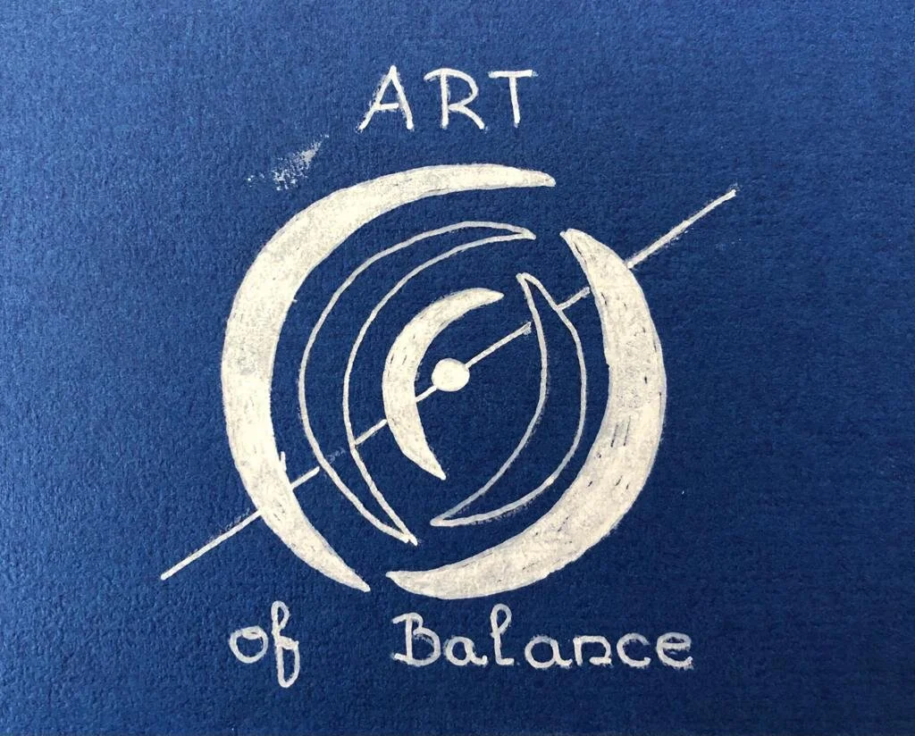
Settled identity for ART of Balance
After seeing stroked marks vs filled marks she decided that a filled mark was the best version for her identity. We will now be moving forward with collateral, advertising material and social media visuals. I’m sure I’ll revisit this as we continue forward.
I think the most important thing for me, is if your client comes to you with an idea or vision, listen to them. They often are their own bosses, know their demographic, and know what they want, even if they say they don’t.*
*except for when they know exactly what they don’t want, but can’t give you indication of what they do want. But that’s for another time.